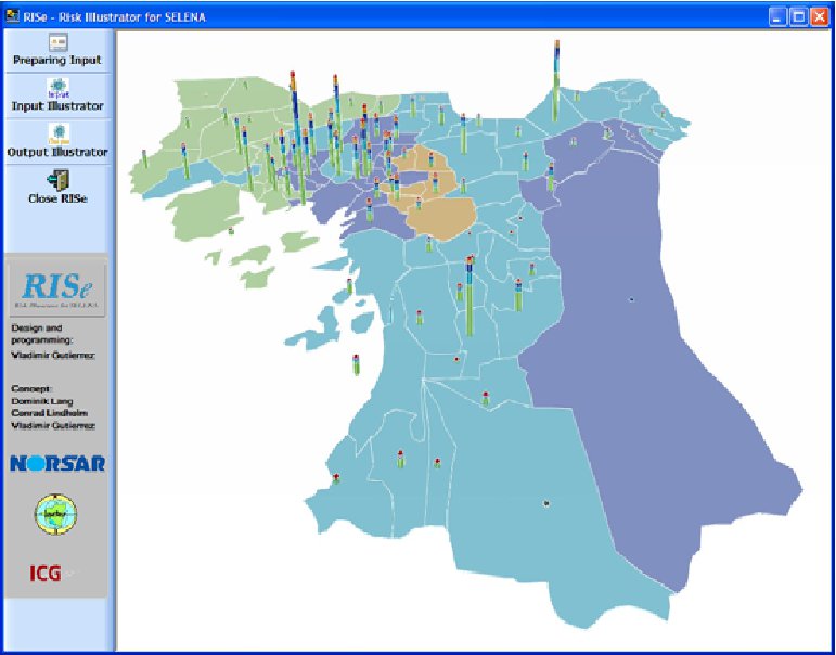
RISe - Risk Illustrator for SELENA
RISe is a stand-alone tool that was developed in order to allow an easy conversion of the geo-referenced SELENA input and output files into Google Earth kml-files. Further, RISe facilitates an easier generation of input files for SELENA, the open source risk and loss computation tool developed by NORSAR. The motivation for developing RISe was to also provide the user with a free GIS to allow the illustration of all geo-referenced SELENA files. In addition to a large variety of commercial Geographic Information Systems (e.g., ArcGIS, ArcView, MapInfo etc.) a number of open-GIS programs are also available (e.g., GRASS GIS, ILWIS, GMT). Even though all of the latter group are powerful tools it is believed that Google Earth is the most prevailing GIS even providing satellite images of almost every built environment in the world.
Basic Features
The current version of RISe disposes of three different main features which will be called by the user before, during and after the SELENA risk computation:-
Before Preparing input (i.e., the preparation of the SELENA input files soilcenteri.txt based on the single geographical units which were demarcated in Google Earth) -
During Input Illustrator (i.e., the conversion of geo-referenced SELENA input files into Google Earth files). -
After Output Illustrator (i.e., the conversion of geo-referenced SELENA output files into Google Earth files).

Illustration types
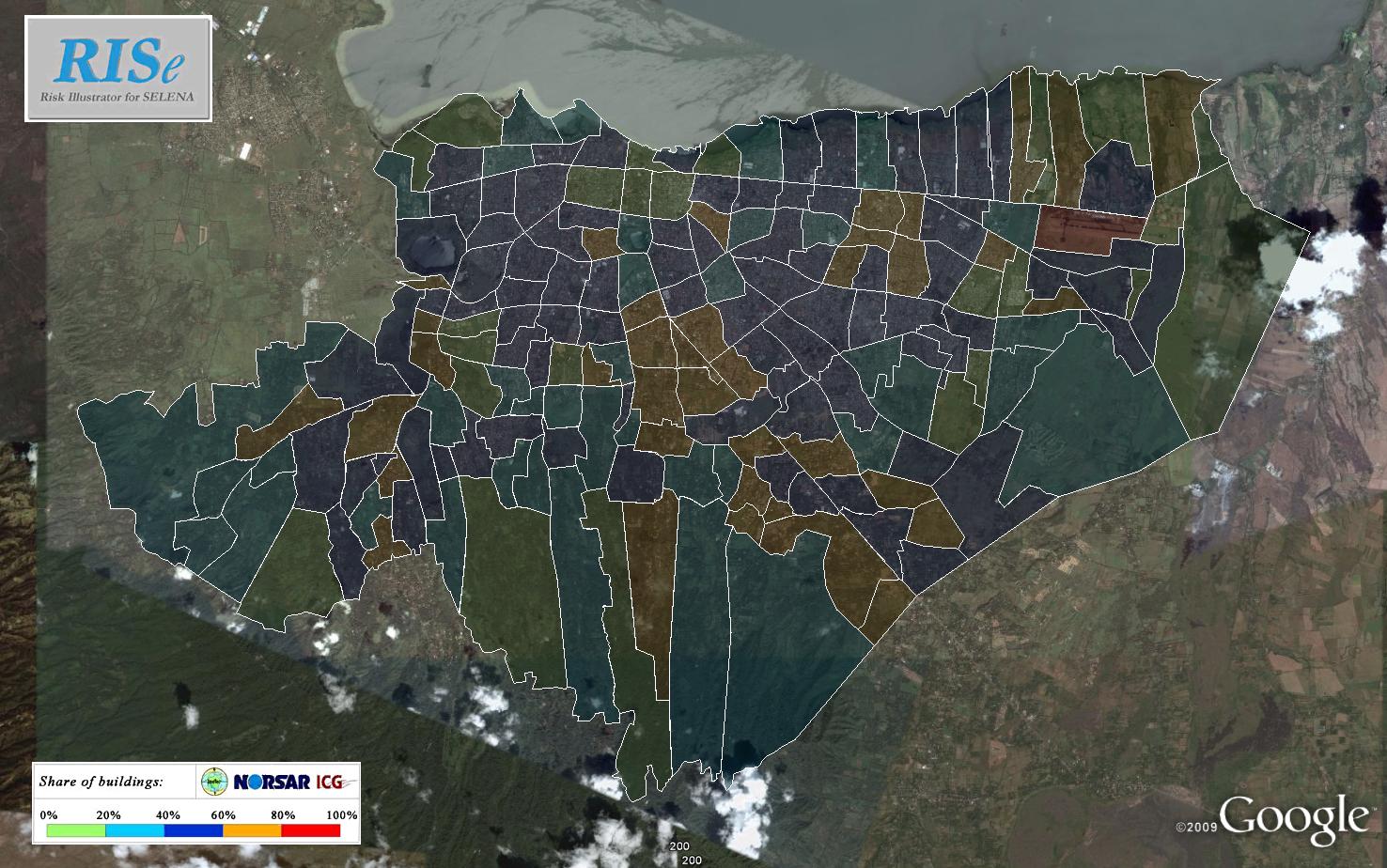
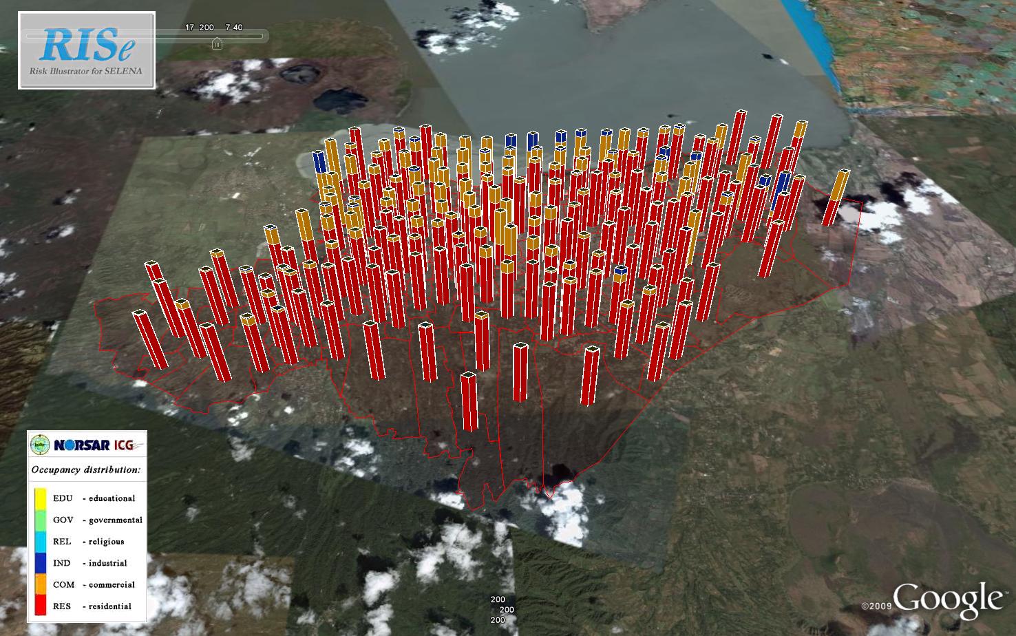
RISe comprises of different illustration types, i.e. the way the SELENA results are plotted. Since especially damage results are somehow difficult to be plotted on a single color-shaded map (Figure 2), alternative illustration types such as ‘bar chart’ plots (Figure 3, Figure 4) are included, which allow the depiction of the damage results for the five different damage states in each geographical unit.


(none) - dhl
